
A trader can have fifteen charts open, three exchange tabs, and a phone full of alerts, yet still miss the one thing that matters most, where the market is moving together. In crypto, that problem shows up fast. Bitcoin is green, a few large names are lifting, smaller tokens are mixed, and the trader is left scanning a wall of tickers without a clean read on whether the move is broad or just a few heavyweights pulling the tape.
A market heat map solves that by compressing a large symbol universe into a single visual panel. The color tells direction, the intensity shows how strong the move is, and the tile size often shows how much weight that asset carries in the view. That makes the heat map a context tool, not an execution tool. It helps a trader understand the market's shape before deciding what deserves a closer chart review, a screener filter, or a watchlist cleanup.
Table of Contents
- Why Crypto Traders Need a Market Heat Map
- How Market Heat Maps Encode Data Visually
- Performance Heat Maps Versus Order-Flow Heat Maps
- Reading Market Breadth and Concentration Signals
- Using Clean Watchlists Alongside TradingView Heat Maps
- Common Mistakes and Limitations to Avoid
- Practical Checklist for Your Heat Map Workflow
Why Crypto Traders Need a Market Heat Map
A live crypto session can turn messy in minutes. One exchange pushes a coin higher, another venue lags, and half the watchlist starts flashing different shades of green and red at the same time. Without a market heat map, a trader is left reading each chart one by one, which makes it easy to miss whether the move is concentrated in a few major assets or spreading through the broader market.
A heat map reduces that noise. It turns a large universe of tokens into a glanceable grid, so a trader can see which names are leading, which are lagging, and whether the move is broad enough to matter. That visual compression is the key reason market heat maps became useful in finance, because colors encode value and intensity rather than exact price levels, and a single screen can show a wide set of securities at once (Investopedia on heat maps).
For crypto traders, the practical benefit is context. A market can look strong on a handful of mega-cap tiles while the rest of the list is weak, and that difference changes how a trader reads the move. A broad green map suggests participation. A narrow one suggests concentration.
Practical rule: a heat map is useful when it answers a market question, not when it replaces chart analysis.
The same logic applies whether the trader is reviewing spot markets, exchange-specific lists, or sector-style groupings. Clean symbol groups make the map easier to trust, which is why a reliable workflow starts with the list underneath the visualization. For ticker format basics that often decide whether a map is readable or messy, this guide on crypto ticker symbols is a useful companion.
How Market Heat Maps Encode Data Visually
A good market heat map is not just colorful. It uses visual rules that let the eye separate direction, strength, and importance in one scan. That matters because crypto traders rarely need a full table of exact values at first glance, they need to know what is moving, how hard it is moving, and how much weight it carries in the universe being viewed.
The three visual layers
Color usually carries direction. Green signals gains, red signals losses, and the exact shade tells the reader whether the move is mild or strong. In most stock-style heat maps, deeper or brighter colors mean stronger movement in that direction, which turns the map into a quick filter for market breadth and relative momentum (XBTFX on stock heatmaps).
Brightness or saturation adds magnitude. A faint tile can mean a modest move, while a vivid tile points to something larger and more decisive. This is why heat maps are more useful than a plain up-or-down list. They separate a token drifting higher from one that is making a much larger move.
Tile area usually shows a weighting variable such as market capitalization or volume. That creates a second layer of meaning. A large tile with a strong color tends to matter more than a tiny one with the same color, because it often has greater portfolio or index impact. Market Line's heatmap example uses tile size = volume and color = 24h change, which shows how size can change the interpretation of the same color field (Market Line heatmap documentation).
The cleanest way to think about it is a city skyline at night. Large bright buildings stand out because they matter more in the visual field. Small dim lights still exist, but they don't dominate the skyline. The same is true in crypto heat maps, where a small token can spike hard without changing the broader market picture much.

A heat map becomes readable only when the trader knows which visual layer carries direction, which one carries magnitude, and which one carries market weight.
Performance Heat Maps Versus Order-Flow Heat Maps
Crypto traders often use the same phrase, heat map, for two very different tools. That creates confusion fast. A performance heat map shows how many assets are moving up or down in a chosen window. An order-flow heat map shows where liquidity is sitting in the order book and how it changes over time.
Performance maps are the scanning tool. They answer the question, “What is the market doing across this symbol universe right now?” In a stock-market style layout, each tile is one asset, and the color reflects its percentage gain or loss over the selected period. TradingView describes performance heat maps as visual tools where tile size reflects an asset's relative weight and color reflects metrics such as price change, performance, or volatility (TradingView heatmaps guide).
Order-flow maps are different. Bookmap and ATAS describe them as time-series views of resting limit liquidity, where price sits on the vertical axis and time runs on the horizontal axis. Brighter zones show denser orders, and fading zones show pulled or absorbed liquidity, which makes the map useful for reading where support or resistance may be building or failing (Bookmap on market depth visualization, ATAS heatmap guide).
Which one fits the workflow
A performance heat map fits market review, watchlist scanning, and universe selection. An order-flow heat map fits execution timing and liquidity reading around a specific asset. They serve different jobs, and they should not be treated as interchangeable.
The confusion usually disappears once the trader asks a simple question. If the goal is to see which tokens are active across a basket, the performance map is the right lens. If the goal is to see where liquidity is resting around one trade setup, the order-flow map is the right lens.
Reading Market Breadth and Concentration Signals
A heat map is only half useful if the trader just watches the brightest tiles. The better read comes from breadth and concentration. Breadth tells how many tiles are green or red. Concentration tells whether a few large tiles are carrying the whole picture.
Breadth first, size second
If many tiles are green, the move has wider participation. If many are red, weakness is spread across the group. If the map is mostly mixed but a few oversized tiles dominate the view, then the move may be real but narrow.
That matters in crypto because big names can lift a map even while smaller names remain weak. StockTitan's live examples show why this is measurable in one view. One S&P 500 snapshot showed 106 stocks advancing, 82 declining, and 312 unchanged, while another major map showed only 43 of 100 names closing higher on July 7, 2026, with NVDA as the largest box, GILD the top gainer at +5.21%, and INTC the worst performer at -9.66% (StockTitan heat map examples).
The lesson for crypto is straightforward. If only a handful of large-cap tokens are green while most smaller tiles are red, the rally is narrow and can be fragile. If the opposite is true, the market may be showing broad participation even if no single name looks dramatic.
Reading rule: a wide green field matters more than one giant green tile.
For traders who use screening workflows alongside the map, this Crypto Screener guide explains how to define a focused symbol universe for follow-up screening and chart review.
Why concentration changes the interpretation
Concentration is what makes the map more than a pretty dashboard. A large tile has more influence on the market picture than a small one, so a few heavyweights can shape the whole reading. In practice, that means the trader should always ask whether the visual strength is broad, or whether it depends on a small cluster of dominant assets.
That distinction helps avoid chasing moves that lack participation. It also helps explain why one exchange or one market-cap bucket can look strong while the broader crypto market is still mixed.
Using Clean Watchlists Alongside TradingView Heat Maps
Watchlists and TradingView heat maps solve different parts of the research workflow. A clean watchlist organizes venue-specific symbols for chart review and compatible screeners, while TradingView's Crypto Coins Heatmap provides a broad visual overview from the scopes available in the Heatmap interface. The two tools can be used alongside each other, but an imported custom watchlist does not directly define the Heatmap's universe.
Organize the symbol universe before screening
A coherent symbol universe is most useful for watchlists, screeners, and focused chart review. A centralized-exchange list should stay on that venue. A market-cap list should stay inside the same size logic. A category list should hold assets that belong together. An ecosystem list should compare like with like.
That structure helps traders apply consistent filters and compare relevant symbols after the broad market scan. It complements a heat map without changing the market scope configured inside the Heatmap tool.
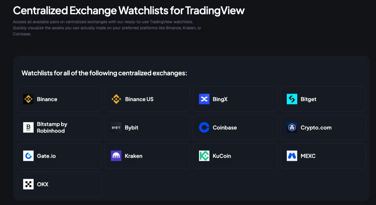
TradingList fits that workflow as a symbol-organization layer. It provides TradingView-compatible crypto watchlists organized by centralized exchange, market capitalization, supported category, and ecosystem, with files formatted for direct import and a daily refresh cycle when source data is available. Its Standard watchlists cover broad maintained lists, Custom crypto watchlists narrow those lists by supported filters, ScreenerList builds a list from market filters, DeltaList compares a reference exchange and pair with selected target exchanges, then identifies the tokens available on each target but absent from the reference, and FusionList combines multiple lists into one exportable configuration.
Why formatting matters before import
TradingView watchlist imports depend on readable symbols. That means the list should already be normalized into the right venue format, such as EXCHANGE:PAIR, before it is imported into a watchlist and used with a compatible screener. A clean import keeps the watchlist and screener results from being cluttered by duplicates, missing prefixes, or symbols that belong in another bucket.
A clean watchlist does not change the Heatmap scope. It gives the trader a reliable symbol set for follow-up screening and chart review.
When a trader imports a tidy watchlist into TradingView, compatible screeners can filter that list. The Heatmap remains a separate tool and uses the market scopes available in its own interface. This makes the workflow complementary: use the Heatmap for broad context, then use the organized watchlist or screener for focused review.

Common Mistakes and Limitations to Avoid
A heat map can look decisive even when the underlying reading is weak. That is why traders should treat it as a starting point, not a verdict. The biggest mistake is reacting to the picture before checking what the picture is built from.
Four traps that distort the read
- Single Snapshot Bias: A single view can hide the fact that the picture changes with the time frame. A 1H map and a 1D map can tell very different stories.
- Inconsistent Color Scales: Different platforms can use different shade logic, so the same color may not mean the same strength everywhere.
- Ignoring Low-Volume Anomalies: A tiny tile with a dramatic color can look exciting, but low-liquidity assets can exaggerate the visual effect.
- Isolated Asset Focus: One strong tile is not the whole market. A lone mover needs broader context before it gets any significance.
These mistakes matter more when the symbol universe is incomplete or stale. If a map includes assets from different classes without normalization, or if the list has old listings and missing names, the result can create false hotspots. Neutral heat-map guidance in other domains makes the same point, users need a decision first, a primary metric, a supporting proxy, and context around the data, or the map can mislead instead of clarify (Mapline on heat map context and validation).
How to validate the picture before acting
A trader should cross-check the map against volume, the chosen time frame, and the composition of the list. If the strongest colors are clustered in low-liquidity names, that deserves caution. If the apparent hotspot is really just a data artifact, a quick chart review usually exposes it.
The best habit is simple. Use the heat map to find where attention belongs, then verify whether the move is broad, liquid, and relevant to the actual trading universe.
Practical Checklist for Your Heat Map Workflow
A useful heat map workflow starts before the chart opens. The trader needs a clean question, a clean list, and a clean interpretation rule. Without those three pieces, the visual can still look interesting while saying very little.
A simple workflow that holds up
- Define the question. Is the trader scanning a broad market, a single exchange, a market-cap bucket, or a category list?
- Choose the right map type. Performance heat maps fit market review, while order-flow heat maps fit liquidity reading around one asset.
- Check the symbol list. The universe should be organized, formatted, and free of obvious duplicates or stale names.
- Confirm the visual encoding. Color, intensity, and size should be understood before any interpretation starts.
- Read breadth before concentration. A wide green field means something different from a narrow rally led by a few oversized tiles.
- Cross-reference the move. Volume, time frame, and chart structure should support the same story before the trader acts.
That checklist shows how watchlists and heat maps complement each other. The Heatmap provides broad visual context, while a well-organized list makes follow-up screening and chart review easier to frame. Tools such as TradingList help by organizing TradingView-compatible crypto symbol universes into maintained lists that can be filtered, compared, combined, and exported for workflow use.
The habit is repeatable. Traders who treat the map as a market context layer, not a signal engine, usually get more value from it over time because they stop asking it to do a job it was never designed for.
TradingList provides TradingView-compatible crypto watchlists organized by centralized exchange, market capitalization, supported category, and ecosystem for watchlist, screener, and chart-review workflows. Traders who want a more structured way to import, compare, and maintain those lists can visit TradingList, then use TradingView's Heatmap separately for broad market context.